BACKGROUND
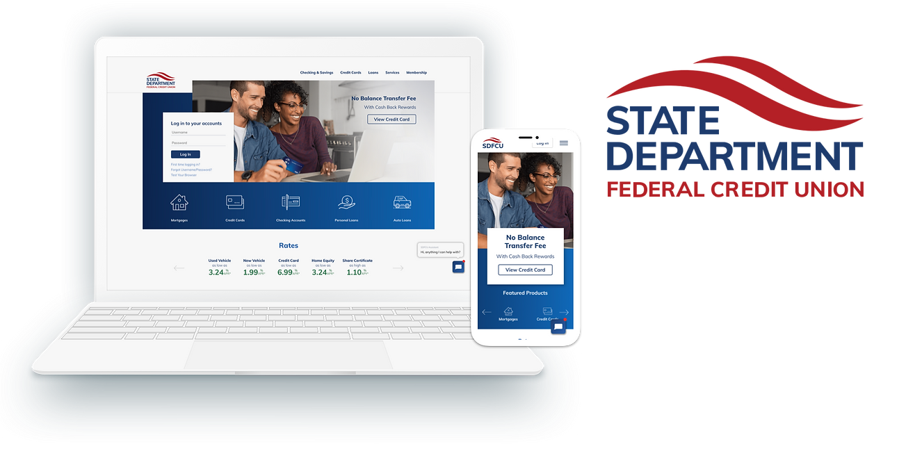
The State Department Federal Credit Union (SDFCU) was chartered in 1935 for the exclusive use of State Department employees and affiliates. Now, decades later, membership has grown to more than 90,000 members worldwide and over $2.4 billion in assets. The bank also extends loan and credit card services to customers who are not affiliated with SDFCU currently. With five locations within DC and Northern Virginia and over 16 co-op locations, SDFCU is a widely trusted banking system in the DMV.
Role
Team
Timeline
Deliverables
UX Lead
Scrum Master
Front-End Developer
Project Manager
Creative Director
6 months
User Research
Sitemap
Wireframes
Design System
Content Strategy
CHALLENGE
SDFCU came to Blue Water with an outdated website and unresponsive website. As a government subsidiary, the bank had been sued due to accessibility issues as well. We were tasked to conduct a complete redesign of the website including a completely new information architecture, responsive web design, and AA accessibility compliance. Along with this, another challenge we had was to increase membership sign-ups and increase brand trust through this redesign.


ACCESSIBILITY
AUDIT
Before diving into heavy research and analysis, we first started with an AA accessibility audit of the existing website. What we found was that the website consistently failed many tests across the board. Results below:
67%
AA accessibility compliance
FAIL
-
Redundant links
-
Branding inconsistency
-
Unstructured HTML
-
PDF & iFrames not responsive and compliant
-
Color contrast issues
-
Multiple page errors and broken links
-
Pages must be readable with Javascript turned off
DISCOVERY
In order to better understand SDFCU's mission, goals, and opportunities, we gained insights from the following activities:
Stakeholder Interviews
10 interviews w/ 17 internal stakeholders across lines of businesses

SEO Assessment
-
578 metadata issues
-
H1 tags coded as "hidden"
-
301 redirects and reduce 4xx errors
-
Outdated sitemap
-
Missing canonical tags

Usability Testing
-
Search and find-ability issues
-
Unresponsive website
-
Broken links
-
Prioritize member benefits

Analytics Review
-
30% sitewide bounce rate
-
Only 23% mobile traffic
-
39% direct traffic
Competitors
Inspiration

USERS
With the information gathered during the discovery process, we were able to identify our target user groups and aspirational groups into three segments.
Younger Non-member
"I need financial information and education no matter where in the world I live."
Older SDFCU member (45+ years)
"I rely on SDFCU for all my banking needs. The branch is so helpful, but I can't find anything on sdfcu.org."
Indirect Member
"I don't know anything about SDFCU or the benefits they offer."

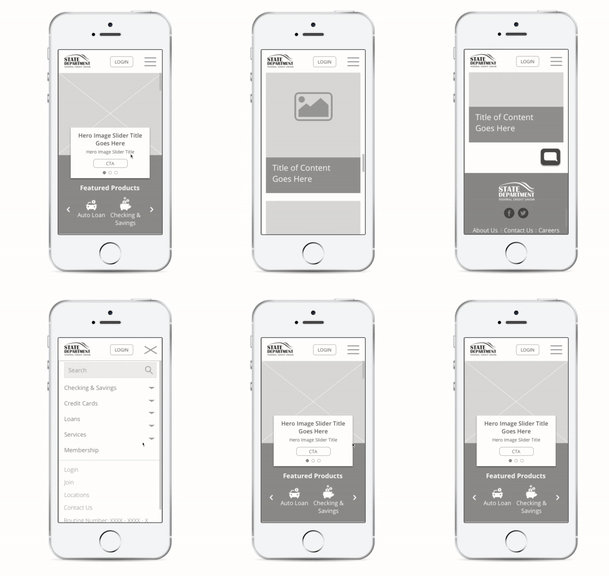
After rounds of revision, we started drafting wireframes to understand basic design outlines and content organization. This process was done by myself and the marketing associate from our client team.
PROCESS
This is where the real work started. We got to work and started drafting a sitemap based on tree testing on existing information architecture and card sorting activities with the client. We conceived the following sitemap and wireframes with these exercises:

DESKTOP

MOBILE


SOLUTION
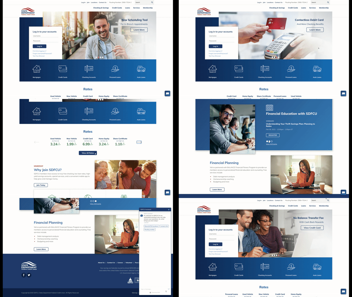
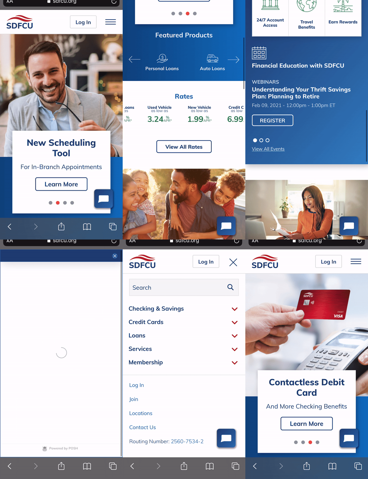
Once wireframes were signed off by development team and clients, final design layouts were created. Below are two depictions (desktop and mobile) of the full redesign. You can find the full live site here.
DESKTOP

MOBILE

Features
-
Responsive web design across mobile, tablet, and desktop
-
Rates slider
-
Updated content centered around member benefits and events
-
Chatbot for customer support
-
New brand and style guide with updated fonts and logo
-
Sub-level navigation with anchor links for product pages
-
Updated sitewide search with SOLR
-
Revamped site structure and page consolidation
-
Sitewide alerts banner for holidays, announcements, and statements
OUTCOMES
After the website was launched, we conducted a post-launch survey with customers and stakeholders and analytics review to review the outcomes of our efforts. Across the board, users had a positive reaction to all the design and content changes. We also conducted an accessibility audit to validate accessibility efforts on the digital experience.
Accessibility
PASS
90%
AA accessibility compliance
-
Zero page error
-
Zero broken links
-
4.5:1 contrast ratio across all images and text
-
Placed alt text on all images and graphics
Web Traffic

+24% users
post-launch

+27% increase in new users

+17% increase in returning users

+45% increase in mobile traffic
Customer Satisfaction


